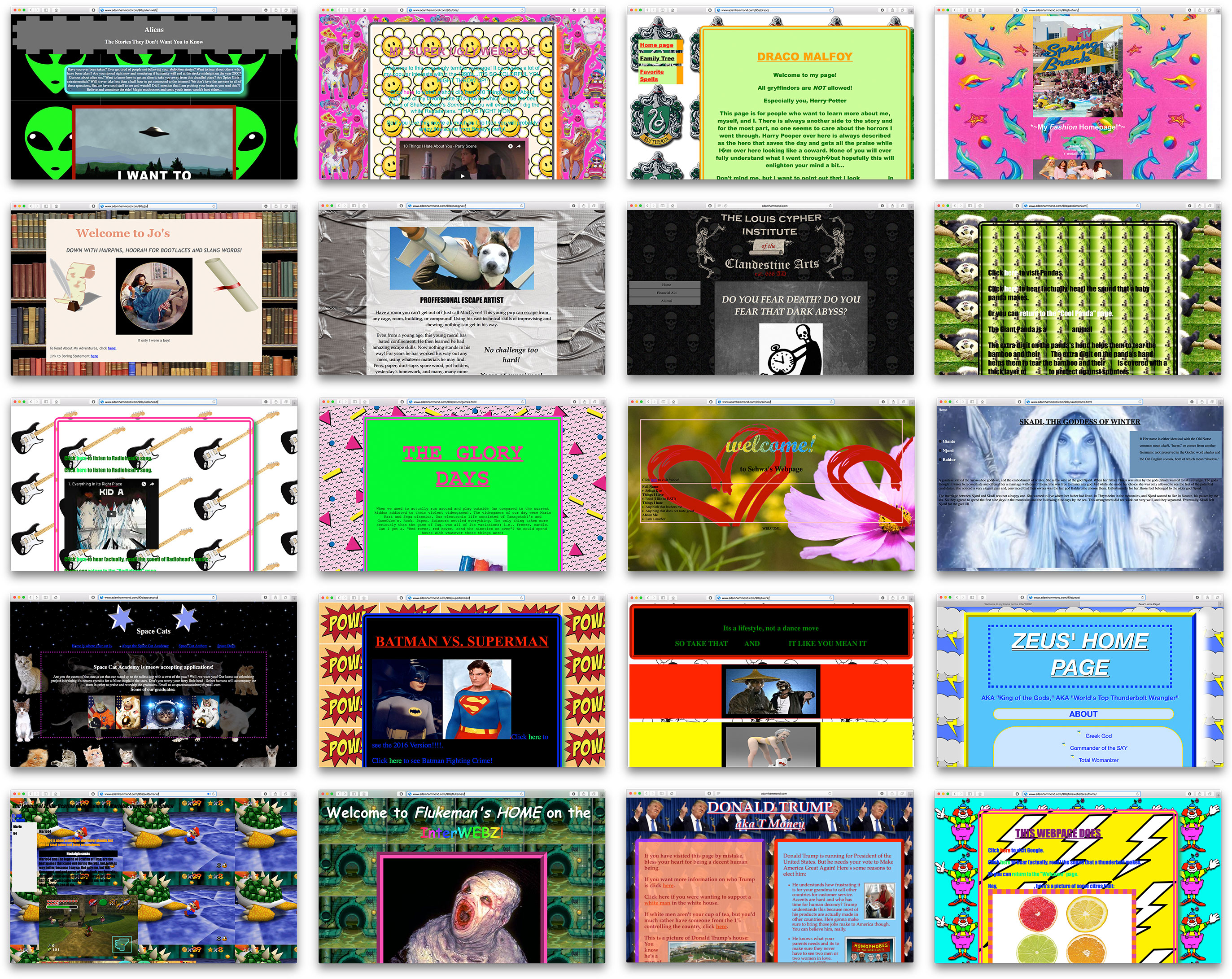
The first assignment for my Intro to Digital Humanities class is a deliberately ugly webpage in the style of 90s personal “homepages.” The idea is to learn HTML and CSS without having to worry much about content, and without having to reign in the desire to use every CSS trick conceivable. I gave students my own take on a very ugly 90s-style website and set them loose.
Students went absolutely wild with this assignment, and the results are spectacular. Follow the links below to explore these truly hideous websites.
- Aliens X-ist, a sendup of 90s conspiracy culture
- My Super Ugly Website, an homage to Lisa Frank, boy bands, and — most of all — to 10 Things I Hate About You, featuring the cutest cursor of all time
- Draco Malfoy, an imaginary webpage for the famous Potter rival
- My Fashion Homepage, a celebration of 90s fashion (a popular topic!)
- Flukeman’s Home on the InterWEBZ, a truly monstrously ugly website that speaks for itself
- Jo’s Fanpage, a 90s-style celebration of this heroine of Little Women
- MacGyver’s Homepage, devoted to a canine problem-solver
- Dark Arts, at a Discount, homepage of the Louis Cypher Institute of the Clandestine Arts (est. 666 AD)
- Pandamonium, a so-cute-it-makes-you-want-to-throw-up page about pandas
- Radiohead, a fan page for the uber-90s British rock band
- Return to the 90s, an unironic love-fest for the best decade ever
- Sehwa’s Homepage, a very 90s personal page
- A Shrine to Skadi, a javascript-heavy ode to Norse mythology
- Space Cats, the homepage of the *fictional* Space Cat Academy
- Batman vs. Superman, a retro-styled fan page for the reboot
- The Art of Twerking (it’s a lifestyle, not a dance move)
- Trump for Supreme Overlord, a viciously satirical Donald Trump campaign website
- The Legend of Zelda: Ocarina of Awesome vs Mario64: Overrated Jumpman, a loud (in many senses) endorsement of the virtues of Ocarina
- Zeus’s Homepage, the homepage of the most bro-like of the Greek gods, featuring altered Wikipedia pages
3 likes

